

Process
Moodboard
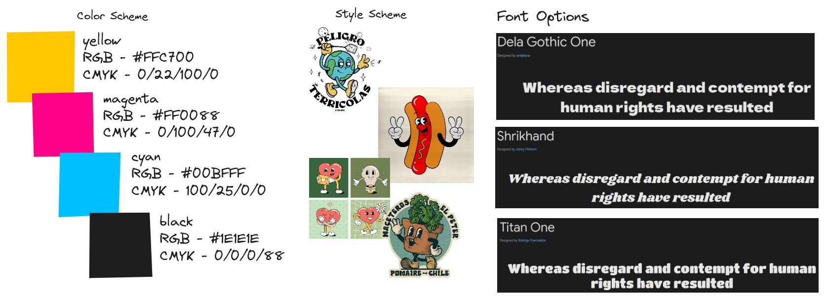
Early on, I wanted to use a mascot as the friendly face for the Inkspread company, so I created a simple moodboard with examples. Additionally, I recorded color codes and typefaces I was interested in trying out later.
Storyboard
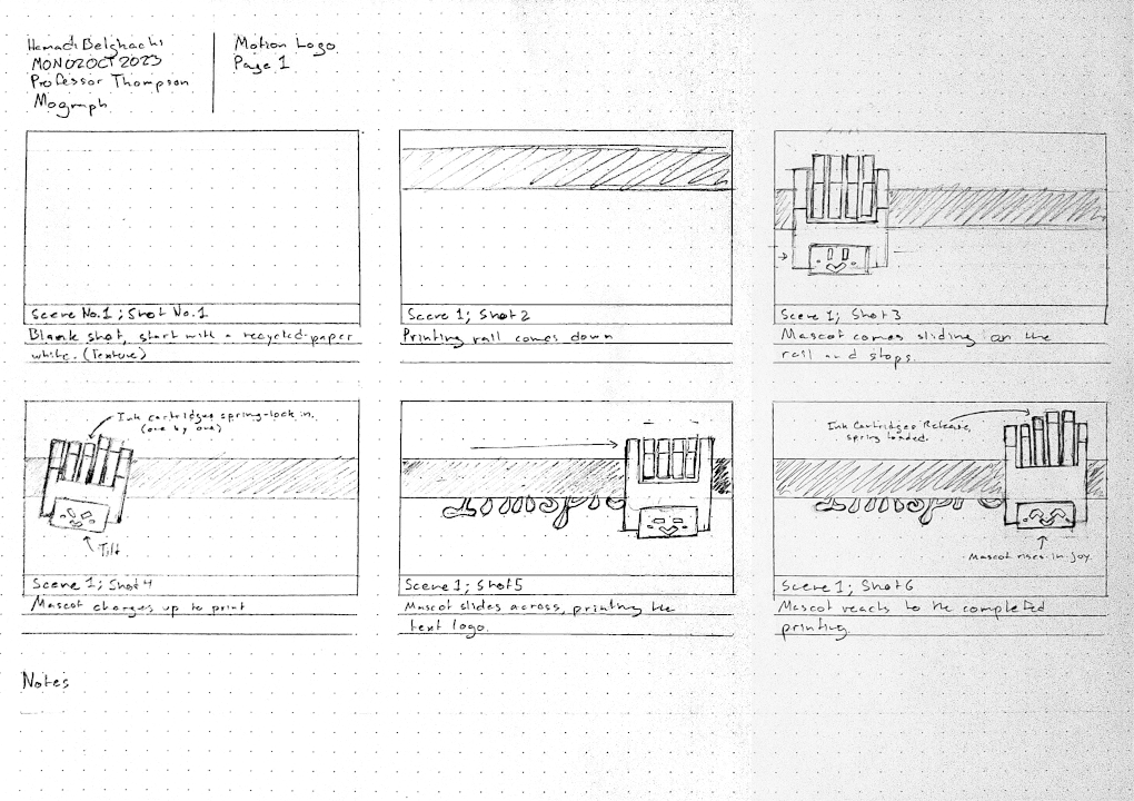
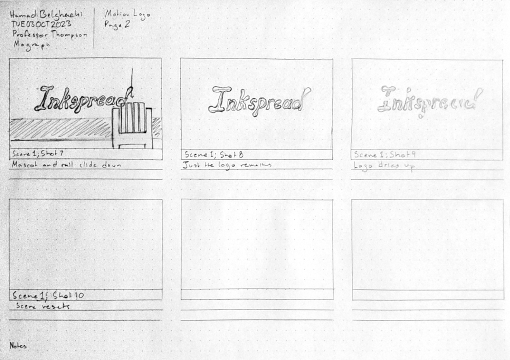
With the mascot design in mind, I drafted a storyboard of how I thought the animation would play out. I wanted to illustrate speed, so I drew the mascot zipping from the left to the right of the screen to demostrate fast, on-demand printing.
Illustrating
Having a clear vision for the animation, I created the mascot and wordmark in Adobe Illustrator. I built the mascot using basic shapes and the pathfinder tool to create a pseudo 3D effect. I ensured that the layers were organized and labeled to make it easier for animating.
Animating
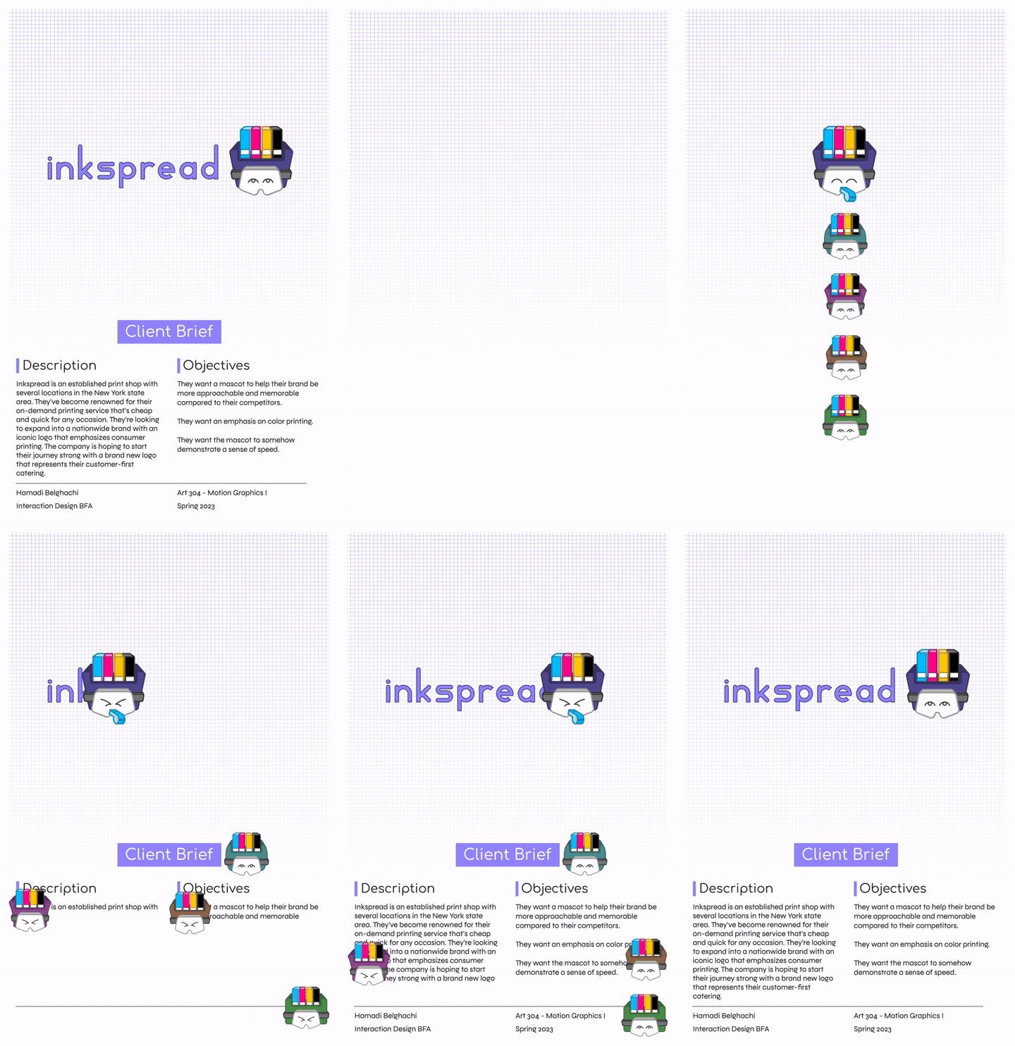
Now with all the assets ready, I animated the motion logo in Adobe After Effects. I created a pseudo skeleton to rig the layers together, making the animation process easier as parent layers affected child layers. I created two versions, one that worked on its own, and the other intended for an Alternative Reality poster hosted on Artivive.

Reviewing
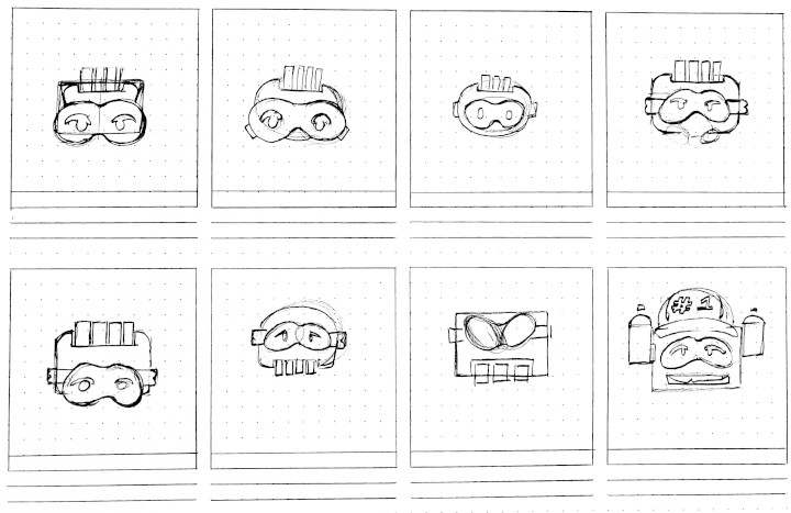
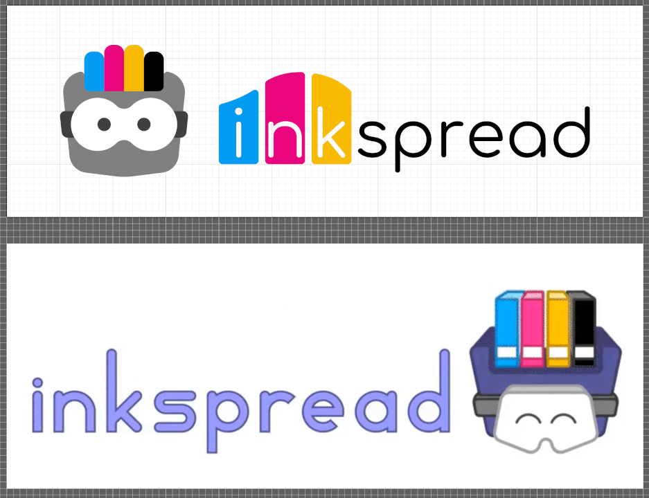
A few semesters later, I revised the motion logo for my Art Exhibition. For this next iteration, I focused on a simpler style that softened the colors and used only solid shapes to convey friendliness in design. When I presented my revised design draft, I received feedback that the redesign was too flat. I brought back shapes from the previous logo to find the perfect balance.
Illustrating
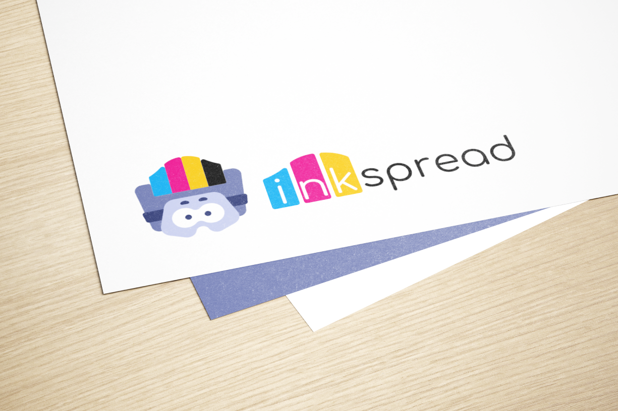
I made the new design in Adobe Illustrator and incorporated all the feedback and knowledge I had gained to improve the Inkspread logo. Instead of making the lettering for the wordmark, I chose the Comfortaa typeface for its geometric shape and rounded caps to fit with the design of the mascot.
Animating
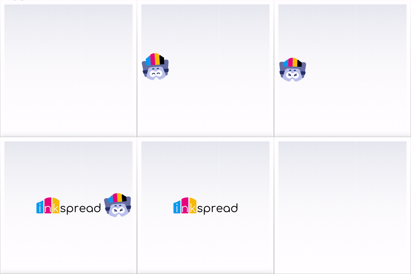
With my final drawing done, I re-animated in Adobe After Effects using the same techniques of parenting layers and keyframes for fine tuning. The resulting animation improved initial ideas and represents a more professional product.
Reflection
Having wrapped up this project, I became better using Adobe After Effects for creating motion graphics. Connecting layers together to create a rig for the logo helped with animating the motion the mascot would make printing on a piece of paper. In tandem, designing a logo and animating it is a delicate challenge that requires careful planning. When I decided to revisit this project with a fresh perspective, I was happy to have had done proper file organization. I was able to quickly pick up where I last left off and understand my original thoughts.