

Responsibility
During my tenure as Creative Director for the student-led newspaper of my university, my duty was to create vibrant banners, new weather icons, covers for the tabloid section, and section logos for the paper. This was an excellent experience that taught me how to prepare graphics for newsprint and working with colleagues unfamilar with Adobe InDesign.
Deliverables
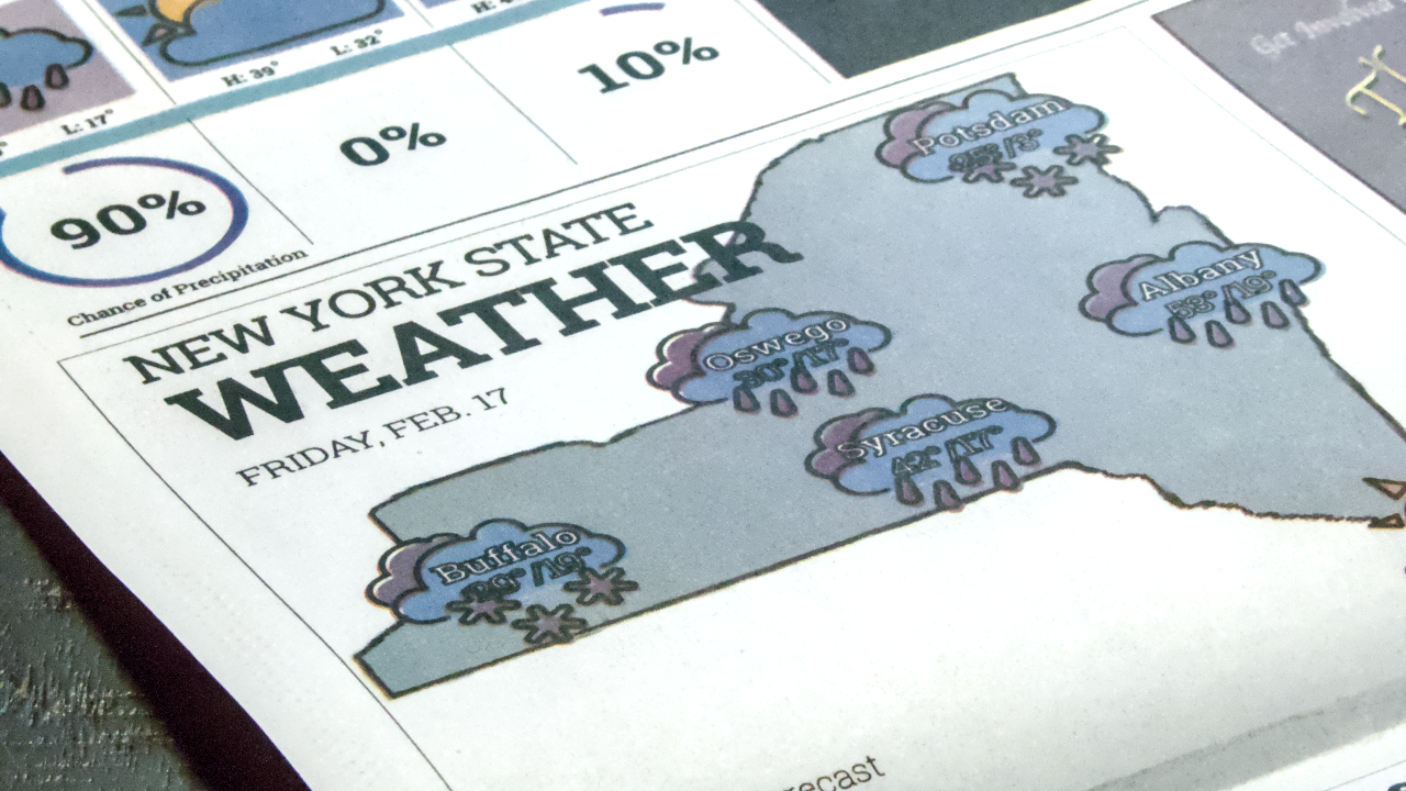
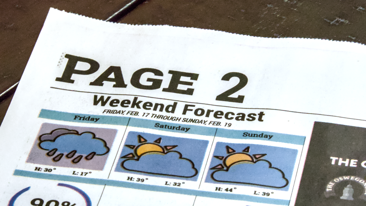
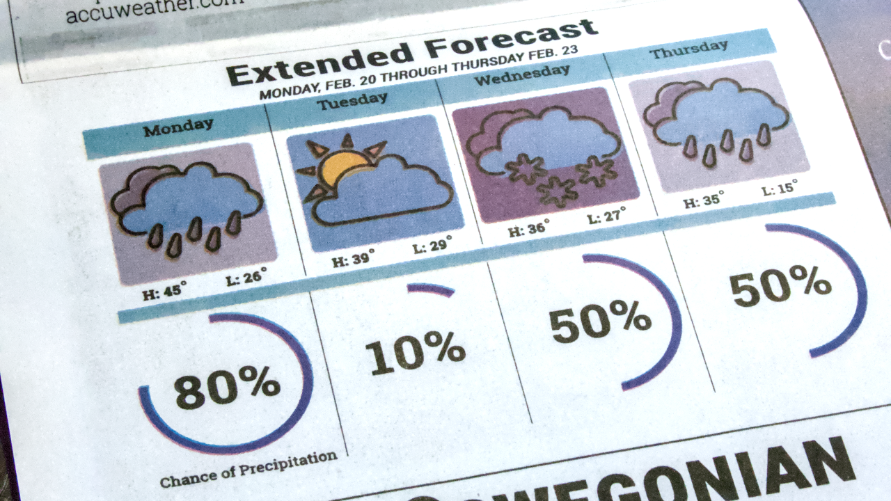
Weather Icons
I took initiative on improving the weather icons as my first task. With a bold black stroke around the illustrations, higher color contrasts, and a cohesive design, the new icons are net improvement over the old icons. I made two versions for each icon, one with a transparent background to be placed on a map of New York and the other with a background color to be used in a chart.

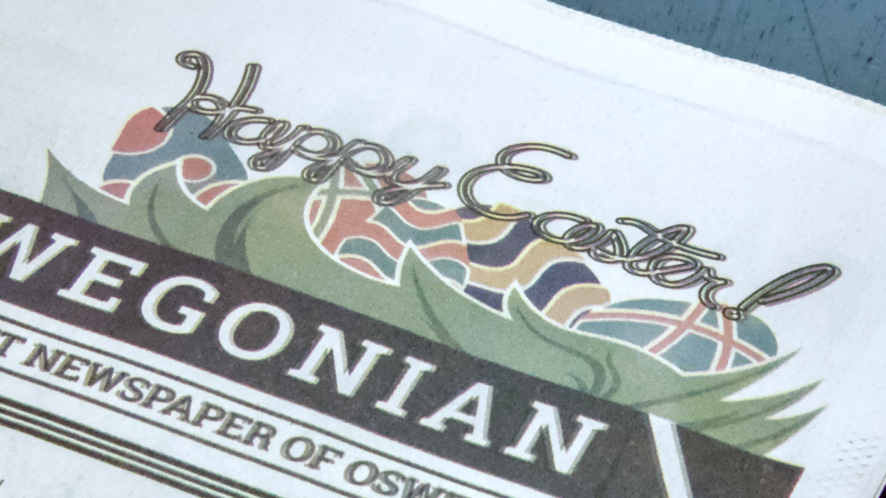
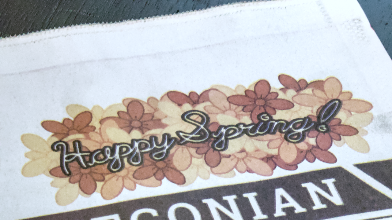
Banner Graphics
Banners are long, landscape-oriented graphics on the front page of the paper just above the nameplate. While this space is typically occupied by an advertisement, there needed to be something when it was empty. Working with the Editor-in-Chief, I created banners that related to the seasonal holidays around the time of publishing. For other times, I made a 'Help Wanted' banner to call for prospective student journalists.
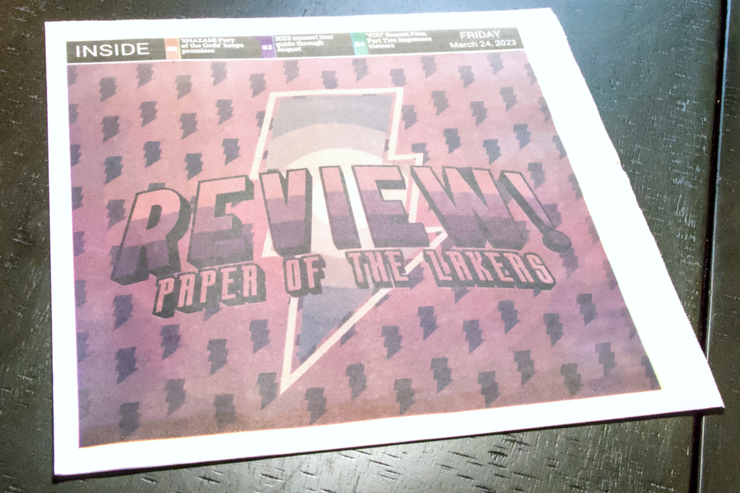
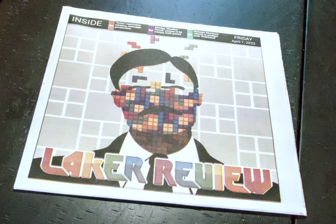
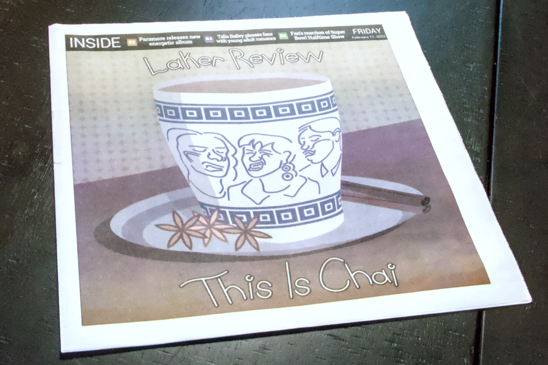
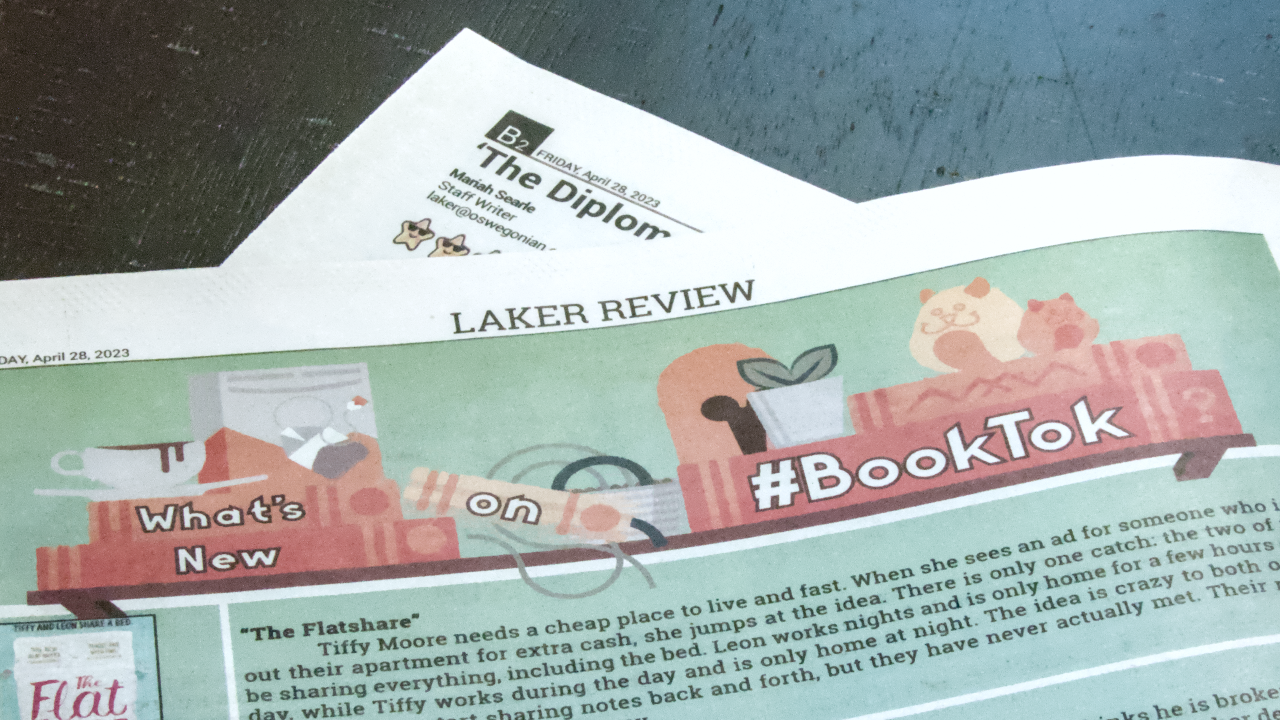
Tabloid Covers
The tabloid section of the paper represented campus culture. In turn, the cover represented the hit pop-culture item in the minds of the students. As a result, the cover often reflected a video game, song, or movie. Each week I met with the Tabloid Editor to learn of the theme. The cover would always be a parody of the cultural session but using the 'Laker Review' title instead.
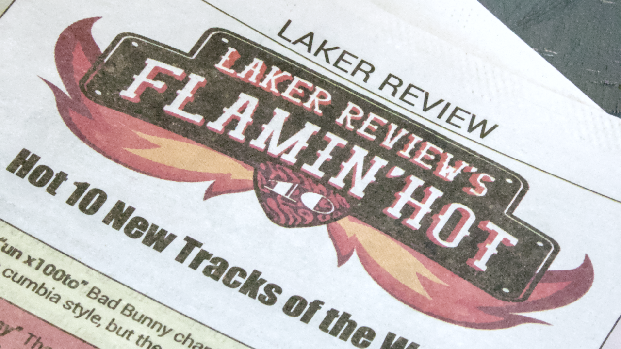
Section Logos
In addition to the tabloid covers, I produced the logos for particular sections of the paper. These logos had to be eye grabbing and excitedly express the content below. I designed each one to stand out from the other to give their own personality.
Reflection
Learning how to tailor graphics for the printing press was a journey. Unfortunately, there wasn't a predecessor creative director at the Oswegonian ready to teach me. I had to learn on my own, and I made great strides doing so. With each issue published, I would comb through the papers looking for issues to fix. It was fun just to spot issues and find the solution.