
Background
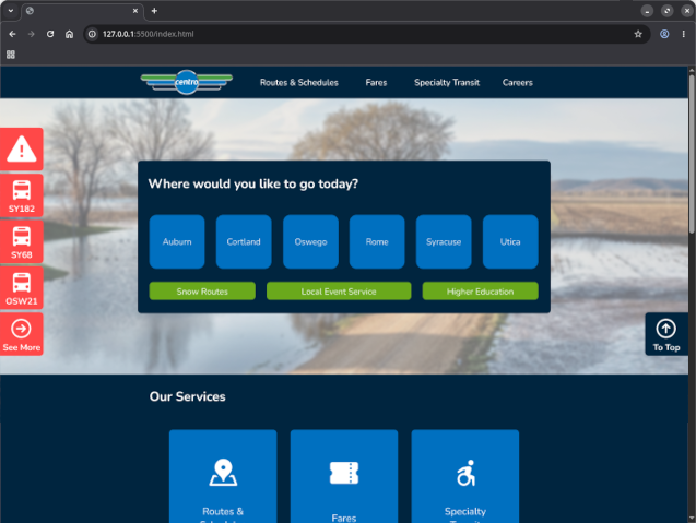
Centro is the public transportation service for central New York. They provide a reliable bus system that New Yorkers utilize daily. However, their website follows dated design practices and does not represent their esteemed service. For this project, I conducted a full usability evaluation of their most critical webpages to create a new interface design that extends their existing brand guidelines. In this process, I directly addressed the pain-points I discovered while conducting user observations and interviews which informed the production of the new interface.
Process
Initial Evaluation
There was limited time available for this project, so I started by reviewing the desktop website for Centro and recording ways the interface layout could be improved. Immediately, I found that the user journey of clicking on different menus was complicated and difficult to keep track of where one came from. From there, I developed user-testing tasks based on my evaluations and common scenarios users may find themselves in.
- Find earliest time the bus will arrive to SUNY Oswego Marano Campus Center on the 246 route to Syracuse for today.
- Find the cost of a Day Pass in Oswego County.
- Find the latest time the bus will arrive to Walmart in Oswego to Downtown Oswego for today.
- Find the phone number used to book an appointment for the Call-A-Bus service.
- Find the PDF detailing the route change the Syracuse 172 bus will take in the event of snow.
- Find the Route Modifications for today.
User Interviews
I interviewed two participants and focused on a young adult audience familar with public transport systems. I wanted to know their impressions and experiences while using any public transportation website. I was able to uncovered their struggle with the Centro website’s poor navigation scheme, difficult-to-understand language used in communicating information, and bus route naming schemes.
User Observations
In the same testing session, I conducted user observation testing based on my set of tasks. What I found was participants complaining about the multiple menus, with one participant believing it was intentional, and often resorting to the search functions to attempt to complete the task. Both participants were confused by the language and identified the wrong phone number for contacting Centro. Finally, both participants struggled to identify the bus they would need to take to reach downtown. With this data collected, I developed my Requirement Statements to guide the rest of the project.
- Language will be clear and concise so that the user can understand what they are clicking on and know what information they will receive.
- Bus routes will be given a designated name that will communicate the journey the bus will take to the user.
- Navigation will be made clearer by simplifying the categorical approach to organization down to two navigation schemes.
Sketching
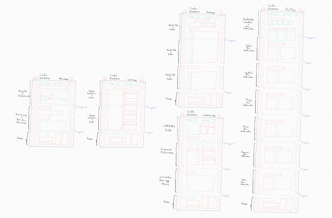
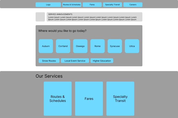
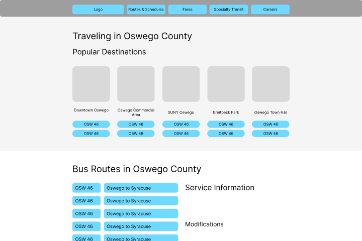
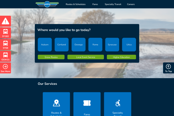
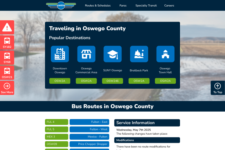
I immediately got to work on sketching a new interface with the users in mind. My main focus for the layout was on my third Requirement Statement, so I simplified the navigation menu to always present at the top and provided a destination shortcut menu for each county.
Low-Fidelity Wireframe
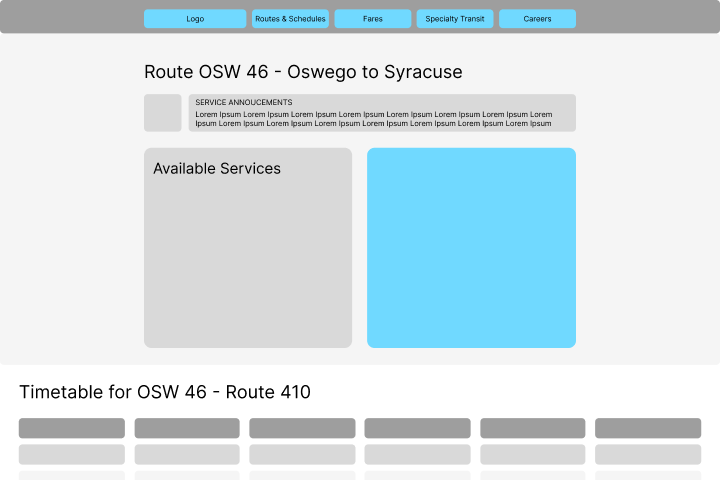
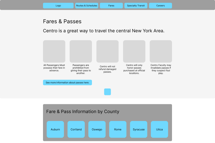
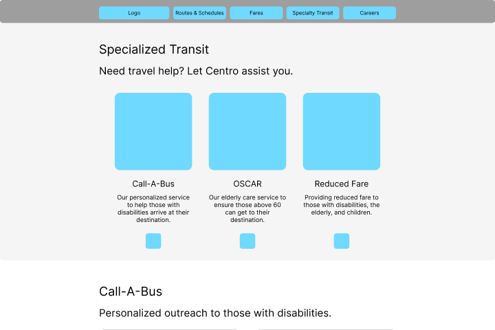
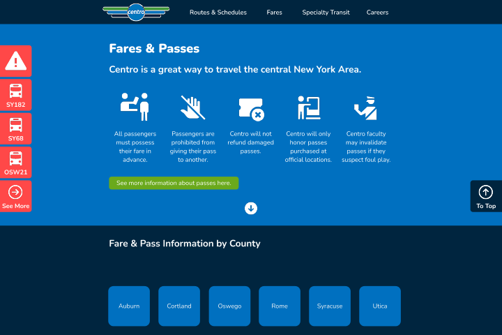
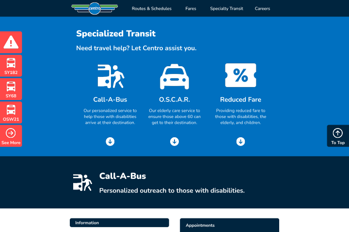
Then, I produced the low-fidelity wireframe using Figma. I expanded upon my ideas by including a hero section at the top of each webpage. This section would have summary information on the contents, such as rules for fares or specialized transit. In the super footer, I included a section that duplicated the most important menu items. By providing this additional avenues, user would have another way to find where they need to go.
High-Fidelity Wireframe
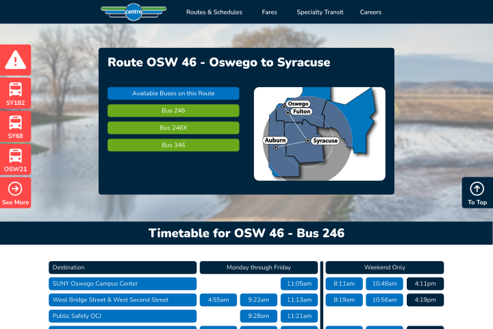
Next, I built the high-fidelity wireframe using Centro's brand guidelines. With their brand colors I created a contrasting interface that made page elements easy to distinguish. I also looked at competing transport systems and found that they include their service disruption notices on the side. This was a great idea, so I quickly incorporated it. Then, I connected all the pages by their respective buttons, making it ready for user testing.
Reflection
Due to the limited time for this project, I didn't have a chance to conduct user testing on the high-fidelity wireframe. Nonetheless, I compiled my findings into a UX report which documented my actions and provided an action plan as how I would carry out future testing. Redesigning the Centro website was an exciting exercise that felt like a positive change on a system people use on a day-to-day basis. It was intriguing to discover how participants struggled on the website and brainstorming ways to resolve the problem. In the future, I hope to do this in a team setting where I can work with others to brainstorm more actionable solutions.